When you meet someone new, it takes the brain approximately 200 milliseconds to process a facial expression and generate a first impression. That first impression can stick for a while and define your whole perception of that person. Now, imagine how fast the brain can process a simple color palette. As such, it is crucial to master color design video games. Color design sets the mood for the whole game and generates emotions within the player before he even starts playing it. As a developer, you absolutely have to nail your color schemes if you want to create an immersive experience with your game. To continue our series of tips and tricks, we will share our experience with this subject today.
The Not-so-Basics of Color Theory
Everyone knows at least a bit about color theory: blue is associated with sadness, red is associated with anger, etc. But what if you want to set the mood for an adventure? Is it possible to use colors in such a way? Your first thought might be “a red mustang is pretty adventurous”. Well, let’s learn from those who make a living off color palettes and first impressions: posters’ designers.
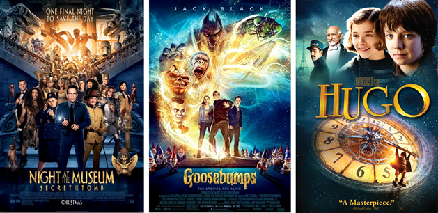
“It’s all in the backlighting and the fairy dust” you say? Well, it sure can’t harm to have a little fairy dust on an adventure. But take a quick 200 milliseconds look and what do you see? Blue and gold. In other words, a pizza is a pizza whatever dressings you put on it. Back to the point, a thoughtful color design can convey way more than simple emotions like sadness or anger. You can induce complex feelings such as the thrill of an adventure or the suspense of a mystery. You just have to find the right color palette for the emotions you want to convey.
The Love Story Between Colors and Level Design
Let’s analyze a level of our first game, Light Fall, to see how we used color theory with a clever level design to create an impactful impression. At the beginning, the player appears out of nowhere. He doesn’t even know who his character is supposed to be. To convey this mysterious ambiance, we went with different variations of blue that we called ‘‘mysterious blue’’ and painted the environment with it.
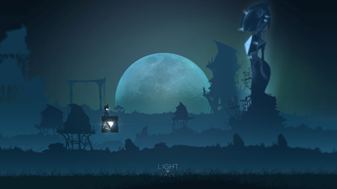
The player then wanders off trying to find clues on what’s going on. He slowly discovers that all the things around him are magical: fireflies guide him on his journey, huge and deadly crystals started to appear out of the ground, etc. These magical elements cried out for a bright color to represent them. As such, we decided to go with ‘‘sparkling pink’’ to contrast our ‘‘mysterious blue’’.
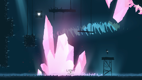
While blue alone can be mysterious, pair it with pink and you get a magical vibe. However, you have to be careful with the presentation of your colors. Specifically, you need to time and space their introduction correctly. If the player would’ve appeared in a blue and pink environment straight from the beginning, the mysterious and eerie feeling around the deadly crystals would have been lost. In our case, a build up was necessary to convey the right emotions at the right time.
In essence, color design in video games is when you join color theory and level design. Slowly implement your colors into the level progression, stay coherent between the player’s emotions and the presented colors and you’ve got yourself an immersive journey.
The Deep Relation Between Colors and Game Design
That’s all cool: colors, emotions and stuff. But we’re making a game, not a movie. So hang on and let’s dive deeper. What’s the utmost aspect of the art of video game and the main difference between films and games? Interactivity. When you have pinpointed the color palette you want to use, it’s important to make interactive elements stand out using those colors. YouTuber snomaN Gaming makes a nice case study of this subject in his video “Rayman Origins: When Art Meets Gameplay”.
As a counter example, he also mentions the old cartoons’ backgrounds… Remember those?

That, my friends, is how you break an immersive experience. This cactus is so obviously not a cactus, it hurts. In TV and movies, it can help the viewer figure out what’s going to happen, but in the case of an immersive video game the use of incoherent colors makes you realize you’re in someone else’s Matrix. Which is the absolute opposite of what you want to achieve, so stick to your palette.
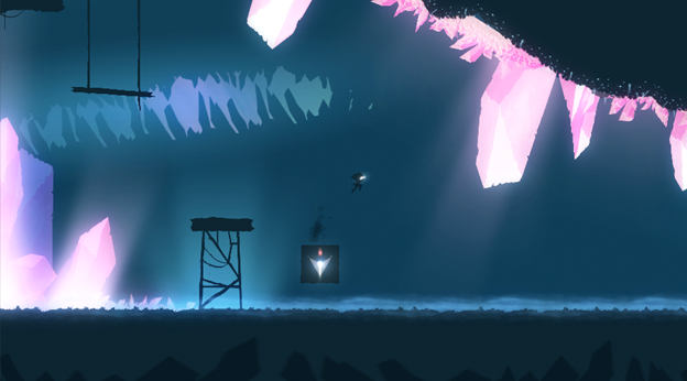
Let’s go back to our initial topic: color design in video games. Remember the blue and pink level we mentioned earlier? In the level, there are two types of objects: interactive and non-interactive. Additionally, there are also two types of colors: dominant blue and highlight pink. You see where I’m going with this? In this level, the bright crystals kill the player if he touches them. Essentially, we wanted to put the “deadly pink crystals” into the spotlight without breaking the immersion or the vibe. By making all the non-interactive stuff blue, we channeled most of the player’s attention towards the interactive crystals, which had a direct impact on his gameplay.
Beyond the Stereotypes of Form and Colors
The pink crystals are not your typical “gonna kill you” stuff, so it may seem strange that we went with this idea. It’s true that pink isn’t commonly used as a dangerous color and that the crystals themselves don’t appear too deadly. However, since they are the highlight of the scene, the player automatically goes ‘‘something’s fishy”, and he is right. We didn’t need to put a red glow around them, we didn’t need a sign “watch out for the pink crystals of death”, we only went with a coherent color design.
To conclude, you need to establish your color palette and embrace it with your game design. You don’t have to go for the stereotypes or the classics. Gamers want to see original stuff, give it to them. All that matters is the coherence and unity of your color design.