Hey folks, here is a short text about our thought process concerning our logo, and the reasons that motivated our approach for this look.
First of all, as much as we like Jesus (who wouldn’t like to turn water into wine and walk on water? That’s like the best super hero power of ALL TIME), Bishop Games and its logo are not associated with anything religious.
It has a much deeper meaning. Prepare yourselves…
The first iteration of the Bishop logo was some sort twister. Our inspiration came from two things mainly. Firstly, we’ve always been fan of Walter Bishop, a character in Fringe, played by John Noble. He’s a kind of crazy scientist with a twisted and crazy mind. Therefore, we had no choices but to get a twister/hurricane in there (told you it had a DEEP meaning).
Secondly, our name is based on the Bishop chess piece, which moves diagonally. You see, we are a bit like the Bishop in the sense where we create our own way, our own path in the video game industry. At least, that’s what we’re trying to do…
At this point, we decided to ”twist the twister” (yes, you read that right), giving it an angular shape.

To enhance and polish the curve line, we tried to base it on the most beloved curve of all, the Golden Ratio curve (google it). At the same time, we tried to hint a B and a G for Bishop Games.
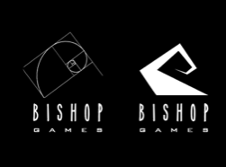
And with some additional work, we gave it a more stable look, better proportions within the negative and positive spaces and a more direct hint at the B and the G letters.

As you most probably know, creating a logo can be one of the most hit or miss thing you can do. Some people will like, others will hate it… But in the end, as long as it represents and means something in the eyes of the creators, the logo is worth keeping.