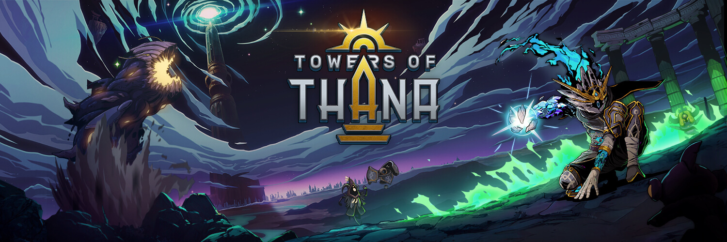
Enhancing Gameplay with Color Value and Contrast Techniques
Have you ever played a game where you felt lost in the middle of the action? It can be for multiple reason: maybe the developer is putting your through a trial by fire and you’re overwhelmed, which can be a genuinely fun and exciting experience. In this situation, you’re feeling lost because you’re not familiar with the mechanics and you’re simply not up to speed yet.
But if you’ve been playing the game for a while and these high intensity moments make you feel lost, there could be something more at play here. It’s possible that the game developers were not careful about the color value for the different elements of the game. As we learned with our own projects, it’s a trap that is very easy to fall into. Let’s dive in!
Realistic Rendering: Be Careful!

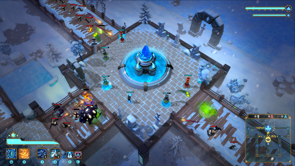
Just to be clear: the left side is a picture of the real world (can be hard to tell sometimes these days!) On the right, it’s a picture of our game Towers of Thana back when our value grading was all over the place. It certainly looks good, but where am I supposed to look at here?
The blue Core in the center does pop-up a little bit. It’s in the center of the image and the blue color helps to set it apart. But the color value doesn’t help.
Color Value: What Is It?
What we mean by “color value” in this context would more or less be the “brightness” value in an HSB context, or “lightness”. Although the HSB color encoding doesn’t allow it though, in theory we should be able to get all the way up to white and all the way down to black for color value.
The Greyscale Trick
Over the years, the industry developed a neat little trick to work with color values and find where they can be improved more easily. On the VFX Apprentice channel, Jason Keyser uses this trick extensively to dissect this subject in the context of VFX specifically. Worth a watch!

What we’re looking for here is the contrasting elements. As you can see, the left side is too bright. The ground is almost a see of white! It steals the show and doesn’t leave room for the other elements that could use that place in the spectrum.
On the right side, we can observe that it’s better. Most elements are closer to the middle range of grey and the more important elements are free to use brighter values… And more! We’re not done yet.

It’s About Contrast
If you have a keen eye, you may have notice that something isn’t quite right in the last 2 pictures. If the purpose of this exercise is to help guide the eye through a more coherent color value, then why is our eye catching on these darker trees?
The reason is that it’s all about contrast. Your eye will be caught by bright elements on a dull background, but it will also be attracted to dark objects in a brighter setting. So in this case, we should ask ourselves if we want these trees to actually stand out or not. It we don’t, we should bring the values to a brighter setting.
Going Further
So far in this article, we adjusted our color values for our environment. You may have noticed that the blue Core in the center pops a bit more than before but really, we could have gone brighter right? I mean, it’s certainly an important part of the game.
Well in fact no, going brighter would have been a mistake. It is important to remember that there’s more than the background elements in a game: VFX and UI are also a vital part of the full experience. Since this asset is part of the background, it’s important to stick to the range of values that is attributed to this purpose.


The VFX and UI elements are allowed a wider range of values. That way, they can create stronger contrasts. It means that when an explosion VFX is going to spawn of top of that core, the VFX will win the contrast war and the player will understand that it’s game over right away.
We’re also placing the enemies in the same range as the background. That way, when they spawn or get hit by a VFX, it stands out, which is exactly what we want.
I hope this post was insightful and that you’ll be able to apply this to your own games! If you need some help though, we’re right around the corner. Just get in touch and we’ll try to help you out!
We Can Help
You could use some help to bring your game to the next level? We’re just 1 message away 👇